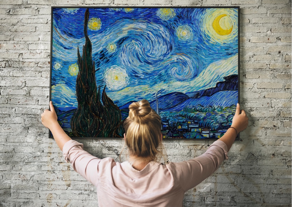

Most of what we know about the ocean, we know from above it. The surface: its color on a clear day, the way storms churn it white, the tide that comes in and goes out like something breathing. What sits beneath all of that, the actual mechanics of the water in motion, has largely been invisible to us, not because it wasn’t there, but because we had no way to render it. A visualization changes that. And when the visualization happens to look like one of the most beloved paintings in human history, people tend to pay attention in a different way than they do for a bar chart or a data table.
NASA’s Perpetual Ocean 2 video uses the space agency’s ocean model, Estimating the Circulation and Climate of the Ocean (ECCO), to visualize the currents, and unlike its 2011 predecessor, this new version shows currents not just at the water’s surface. The result is something that stopped people mid-scroll. It went viral quickly, with viewers comparing the swirling current patterns to Vincent van Gogh’s iconic painting Starry Night from 1889. It’s a fair comparison. The same looping, restless energy that van Gogh pressed into oil paint in a small asylum room in southern France turns out to be the actual behavior of water moving through our oceans. The planet has been doing that all along. We just couldn’t see it.
What makes the comparison feel like more than a visual coincidence is the reason those patterns exist in the first place. The ocean doesn’t move arbitrarily. Every swirl in that visualization is physics made visible, the consequence of forces that have been operating continuously for longer than humans have existed. Understanding what you’re looking at, and why it matters so much right now, is worth more than a few seconds of appreciation.
What ECCO Actually Is
Historically, the ocean has been difficult to model. Scientists struggled in years past to accurately simulate ocean currents or predict fluctuations in temperature, salinity, and other properties, and as a result, models of ocean dynamics rapidly diverged from reality, which meant they could only provide useful information for brief periods. The problem wasn’t a lack of effort. The ocean is genuinely hard to observe. It’s enormous, it’s three-dimensional, and most of what happens in it occurs somewhere humans can’t easily go or see.
In 1999, a project called Estimating the Circulation and Climate of the Ocean (ECCO) changed all that. By applying the laws of physics to data from multiple satellites and thousands of floating sensors, NASA scientists and their collaborators built ECCO to be a realistic, detailed, and continuous ocean model spanning decades. The project includes hundreds of millions of real-world measurements of temperature, salinity, sea ice concentration, pressure, water height, and flow in the world’s oceans. Every swirl in the visualization isn’t artistic license. It is reconstructed from actual data.
ECCO is a joint project between NASA’s Jet Propulsion Laboratory and MIT, and the model output used in Perpetual Ocean 2 is from ECCO-2, covering the years 2021 to 2023. The visualization shows ocean currents at all depths, with those closer to the surface (above 600 meters depth) rendered in white, while currents from 600 meters down appear in progressively darker shades of blue. That layering is what makes it so visually striking. You’re not just watching the ocean’s surface. You’re watching the whole column move.
Why the Ocean Moves at All
The short answer is: physics. The longer answer involves the fact that we live on a spinning planet, and spinning planets do something interesting to the fluids on their surfaces.
The Coriolis effect, named for the 19th-century French mathematician Gaspard-Gustave de Coriolis, is what happens when moving objects are deflected by the rotation of the Earth. In the Northern Hemisphere, the deflection goes right. In the Southern Hemisphere, it goes left. This is why hurricanes spin counterclockwise in the North and clockwise in the South. It is also why ocean currents don’t just flow in straight lines between warm and cold zones the way you might expect if you drew them on a flat map. They curve, they spiral, and they form those loops that look, in the Perpetual Ocean 2 footage, so much like van Gogh’s brushwork.
Large-scale wind patterns drag ocean surface waters with them, creating complex currents, including some that flow toward the western sides of ocean basins. These currents hug the eastern coasts of continents as they head north or south from the equator. The three most prominent of these western boundary currents are the Gulf Stream, the Agulhas, and the Kuroshio.
These aren’t abstract geography. The Gulf Stream is the reason much of western Europe has a climate far milder than its latitude would otherwise predict. The Kuroshio runs along Japan’s coast. The Agulhas moves along southern Africa. Each of them is a massive river inside the ocean, transporting heat, salt, and the conditions that make certain parts of the planet livable.
The Ocean as a Life-Support System
In addition to affecting global weather patterns and temperatures, western boundary currents can drive vertical flows in the oceans known as upwellings, which bring nutrients up from the depths to the surface, where they act as fertilizer for phytoplankton, algae, and aquatic plants.
Think of it like this: the deep ocean is cold, dark, and thick with nutrients that have accumulated on the seafloor, sinking down from the surface across millions of years. Upwelling is the process by which those nutrients get returned to where sunlight can reach them. When cold, nutrient-rich water rises into the sunlit upper ocean, phytoplankton bloom. Fish follow. Marine mammals follow the fish. An entire food web assembles itself around a current pattern that most people have never heard of.
Coastal upwelling ecosystems, such as those along the west coast of the United States, are some of the most productive in the world, and although coastal upwelling regions account for only one percent of the ocean surface, they contribute roughly 50 percent of the world’s fisheries landings. Half of the world’s fisheries from one percent of the ocean’s surface. That is the scale of what ocean circulation does.
The currents also regulate heat and temperature across entire continents. Without them, the temperature swings between seasons and between regions would be far more extreme. The ocean absorbs heat in some places and releases it in others, redistributing energy across the planet in a way that keeps temperatures within ranges that agriculture, ecosystems, and human civilization have come to depend on. What the Perpetual Ocean 2 footage makes visible isn’t just beautiful. It’s the machinery that makes this planet work.
The Gulf Stream, Specifically
The Gulf Stream gets more public attention than most ocean currents, and that attention is increasingly anxious. It begins in the tropics, where the water is very warm, and carries that warm water up the eastern coast of North America before crossing the Atlantic, wrapping around Europe, Iceland, and Greenland, and then cooling and sinking deep into the North Atlantic.
That sinking is what drives the whole system. Cold, dense water descends. Warm water from the tropics rushes in to replace it. The loop continues. Scientists call the broader Atlantic system the Atlantic Meridional Overturning Circulation, or AMOC, and it is the part of the ocean’s conveyor belt that has researchers most concerned right now.
You can find the Gulf Stream running distinctly bright and insistent through the visualization, a white thread pushing up the American coast and then spreading across the North Atlantic. Watching it, it’s hard not to feel the weight of how much that one current is doing.
What Scientists Are Watching
The Atlantic Meridional Overturning Circulation functions like a vast conveyor belt, transporting heat, salt, and freshwater through the ocean and influencing climate, weather, and sea levels around the planet, and a growing body of research suggests it’s weakening as human-driven global warming disrupts its delicate balance of heat and salinity.
The AMOC has only been continuously monitored since 2004. Climate models generally agree it’s on course to weaken this century, though there is a significant amount of uncertainty about the extent of that decline. The stakes are considerable: an AMOC collapse, which last occurred roughly 12,000 years ago, would cause widespread disruption.
The concern centers on freshwater. As Greenland’s ice sheet melts under warming temperatures, it releases large volumes of freshwater into the North Atlantic. Freshwater is less dense than salt water. It doesn’t sink the way cold, salty water sinks, and that sinking is what powers the whole circulation system. Disrupt the sinking, and you disrupt the conveyor belt that has been running the same way for thousands of years.
New analyses and 2026 papers have raised the prospect that the AMOC could weaken far faster than many earlier models suggested, with some studies projecting a possible mid-century tipping point, while others emphasize that a full collapse this century remains uncertain. Scientists are not in full agreement on timelines, and that uncertainty matters. The honest version of the science is that the range of possible outcomes is wide, and it spans from “significant but manageable disruption” to something considerably more serious.
This is precisely why the ECCO model, and visualizations like Perpetual Ocean 2, matter beyond their aesthetic appeal. Researchers rely on the model output to study ocean dynamics and track conditions crucial for ecosystems and weather patterns, in a modeling effort supported by NASA’s Earth science programs and the international ECCO consortium, which includes researchers from NASA’s Jet Propulsion Laboratory and eight research institutions and universities. Every year, according to NASA Science, more than a hundred scientific papers draw on ECCO data. The visualization is both art and early warning system.
What We’re Really Watching
There’s a particular quality to what happens when something invisible becomes visible. Not explained, not described, but actually rendered in a form you can watch. A parent who has spent time staring at an ultrasound image knows the feeling: the abstract thing you understood intellectually becomes suddenly, undeniably real.
The van Gogh comparison keeps catching people because it points at something true. He painted the world as a system of forces in motion, with a sky full of kinetic energy that appeared to most observers as simply a night without features. The ocean works the same way. From the surface, it looks like water. Underneath, it is a planet-scale engine running on heat, salt, gravity, and spin, and it has been doing that without pause for longer than our species has existed. Watching the white swirls push through the Atlantic in a visualization built entirely from real measurements is one of the more clarifying ways to understand what’s at stake if those patterns change.
The current was always there. Now we can see it. Whether the people and institutions in a position to do something with that information choose to act accordingly is the question the visualization cannot answer, but it makes the question impossible to ignore.
AI Disclaimer: This article was created with the assistance of AI tools and reviewed by a human editor.