

Researchers at the University of Rochester found that simply wearing the color red makes a man more attractive and sexually desirable to women, with the effect holding across multiple cultures. The study tested participants in the US, England, Germany, and China, and the results were consistent everywhere. The color makes men appear more powerful – women in the study viewed men in red as higher in status, more likely to make money, and more likely to climb the social ladder.
Color psychology and attraction have been studied seriously for decades now, and the findings hold up across cultures in ways that surprised researchers. The patterns are consistent enough to be worth paying attention to, whether you’re the woman doing the noticing or the man trying to figure out why some outfits just work better than others.
What follows is a breakdown of the eleven colors that consistently register as attractive on men, why each one works on a psychological and perceptual level, and what it looks like in practice.
1. Red

Women are apparently unaware of this arousing effect – it’s not a conscious preference but something happening below the surface of deliberate thought. Red has carried associations with dominance, passion, and social rank across human cultures for thousands of years, and the brain has internalized that association so thoroughly that it operates automatically.
In practical terms, red doesn’t have to mean a full crimson suit. A red polo shirt, a red tie, a red jacket worn casually over a white shirt – the effect appears to be triggered by the color itself, not by any specific garment. It’s one of the few style choices with actual peer-reviewed muscle behind it.
2. Navy Blue
Navy blue combines authority with approachability, making it universally flattering and psychologically powerful, communicating competence while being less harsh than black. Most colors lean one way or the other – imposing or approachable, formal or relaxed. Navy manages both simultaneously.
Navy blue works across a broader range of occasions than any other shade, from job interviews to weddings, and pairs with virtually every shirt and shoe combination. For women assessing a man’s overall presentation, effortless coherence reads as competence – and competence is genuinely attractive.
Navy blue strikes the perfect balance between professional and approachable – unlike bright blue, which can feel overwhelming, navy offers a soothing quality while communicating trustworthiness and intelligence without appearing stuffy or overly formal.
3. Black

Black inspires confidence and leads others to perceive the wearer as more trustworthy and capable, associations that connect to both intelligence and attractiveness. It also has a slimming perceptual effect: research found that black, along with blue and red, leads to an underestimation of body size, while colors like green, grey, and white produced body size overestimation in observers.
Black removes noise. There’s nothing for a woman’s eye to get snagged on – no competing pattern, no questionable color choice, no “what were you going for here?” moment. The man wearing black is the focus, not the outfit. That clarity is its own kind of statement.
Black’s one limitation is occasion-blindness. A man in head-to-toe black at the wrong event can read as someone who doesn’t quite know the room. The color rewards context awareness, which is itself an attractive quality when it’s present.
4. Burgundy
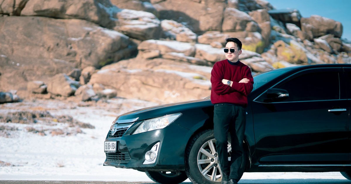
Burgundy is bold without being brash, rich without being gaudy, with a warmth and depth that navy can’t quite match. For women who respond to a man who makes deliberate choices rather than defaulting to the obvious, burgundy signals exactly that.
The color carries the depth and seriousness of red without red’s more aggressive associations, and it has the sophistication of dark navy without disappearing into it. In recent years, more relaxed dress codes and a love for statement pieces have put wine-colored clothing firmly back on the style map. Burgundy in a sweater, a blazer, or even a pair of chinos reads as intentional – the mark of someone who thought about what they put on.
It also plays extremely well with skin tones across the spectrum. The warmth of the hue complements both cool and warm undertones, which makes it one of the more forgiving statement colors a man can reach for.
5. White

White looks easy until it doesn’t, and when a man wears it well – a fitted white shirt, a crisp white tee that actually fits, a white linen shirt in summer – the effect is clean and immediately appealing. White reads as fresh, open, and honest, making a person seem more trustworthy and friendly.
A well-fitted white shirt on a man cuts across preferences in a way that’s hard to explain but very easy to observe. It has no pretension. It’s not trying to be interesting – it just is, when worn with confidence and the right fit. The fit matters enormously here, more than with any other color, because white hides nothing.
White also interacts well with other colors women find attractive on men, serving as the foundation that makes navy, black, or burgundy pop when worn together. It’s less a solo color and more the piece that makes the rest of a wardrobe legible.
6. Charcoal Grey
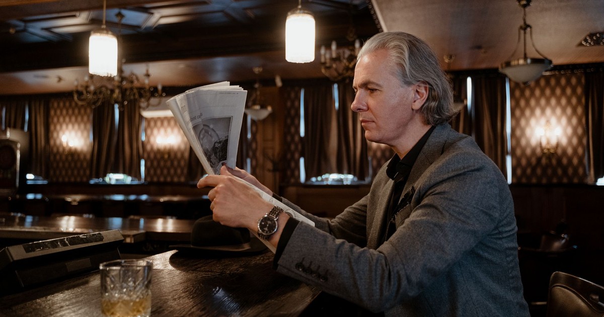
Charcoal grey sits at the serious, authoritative end of the grey spectrum. Navy or charcoal grey are considered standard choices for situations that require projecting professionalism and trustworthiness, with charcoal specifically projecting greater authority than navy. Authority, in reasonable doses, is genuinely attractive – it reads as someone who has things handled, which is one of the qualities women consistently rank as appealing in a partner.
Unlike lighter greys, which can veer towards looking washed out or underdressed, charcoal has enough depth to anchor an outfit. It works in tailored pieces especially well – a charcoal suit or blazer has a weight and seriousness that carries into how the man wearing it is perceived. Pair it with a white shirt and it becomes one of the most quietly powerful combinations in menswear.
Charcoal is forgiving across a wide range of skin tones and hair colors. It doesn’t compete. It just holds its ground.
7. Olive Green

Golden, warm undertones in a man’s complexion respond particularly well to earthy shades like olive, camel, and warm white. Olive also reads as grounded, outdoorsy, and effortlessly put-together – associations that translate directly to attractiveness for many women.
The color has a long history in military and workwear contexts, which gives it a subtle edge of functionality. A man in olive doesn’t look like he’s trying too hard. He looks like he’s someone who does things – a quality that registers long before any conscious assessment of the outfit kicks in.
Olive works across casualwear in a way that most other colors in this list don’t. It looks right in a field jacket, a pair of cargo pants worn without irony, a cotton shirt, or a knit pullover. It’s one of the colors that benefits from being worn in relaxed contexts, where the visual message is ease rather than effort.
8. Forest Green

Forest green is distinct from olive in important ways – it’s deeper, richer, and carries a more formal energy when worn in structured pieces. The color has moved beyond purely casual applications and into genuinely considered style territory.
Where olive reads as casual and functional, forest green reads as considered and slightly unexpected. A forest green blazer or sweater on a man registers as a choice – someone who thought about color and landed somewhere more interesting than the default navy or grey without tipping into peacocking. That balance of deliberateness and restraint is something women tend to notice and respond to positively.
The color also has strong seasonal associations that work in its favor. In autumn and winter, forest green has a richness that photographs beautifully and reads warmly in person. It’s the color equivalent of a well-chosen book on a shelf – interesting enough to prompt a question, substantial enough to deliver an answer.
9. Camel and Tan
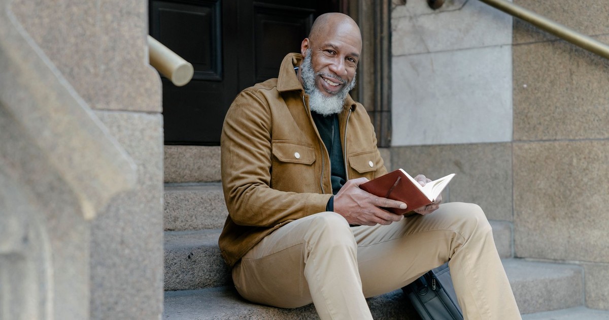
Camel and tan communicate warmth, ease, and a certain kind of understated confidence that darker colors can’t replicate. Camel ranks among the most sophisticated colors for men, communicating refined taste and competence across multiple contexts, from business to social situations. The reference to luxury materials – cashmere, suede, leather – is part of what makes camel particularly resonate. It reads expensive even when it isn’t.
Tan works similarly but with a more casual, sun-warmed quality. A tan chino or a camel-colored coat on a man in autumn strikes a register that’s simultaneously approachable and polished – a combination genuinely hard to achieve. Warm undertones in skin respond well to camel in particular – and when the color complements the complexion rather than competing with it, the overall effect is more cohesive and, by extension, more attractive.
These shades also serve as excellent neutrals that make pairing colors simpler. Camel and tan sit naturally alongside navy, white, forest green, and burgundy, which means a man who owns a few pieces in these tones has an easy foundation for putting together outfits that look deliberate without requiring much effort.
10. Purple

Men are more likely to get a “yes” when they ask women for a date if they’re wearing purple – a bold claim backed by survey data. Purple is historically connected to royalty and distinction, it reads as creative and unconventional, and it signals a man who’s comfortable enough in himself not to reach for the most obvious choice.
The color works best in its deeper, more saturated forms on men – plum, aubergine, and rich violet rather than lilac or lavender, which require a specific confidence to carry in a masculine wardrobe. A purple shirt, a purple knit, or even purple as an accent color in accessories lands exactly where it should: communicating attentiveness without anxiousness, the mark of someone who chose deliberately rather than defaulted.
Purple carries creativity, distinction, and a refusal to be entirely predictable. For women who value those qualities in a partner, the color functions almost as shorthand.
11. Light Blue
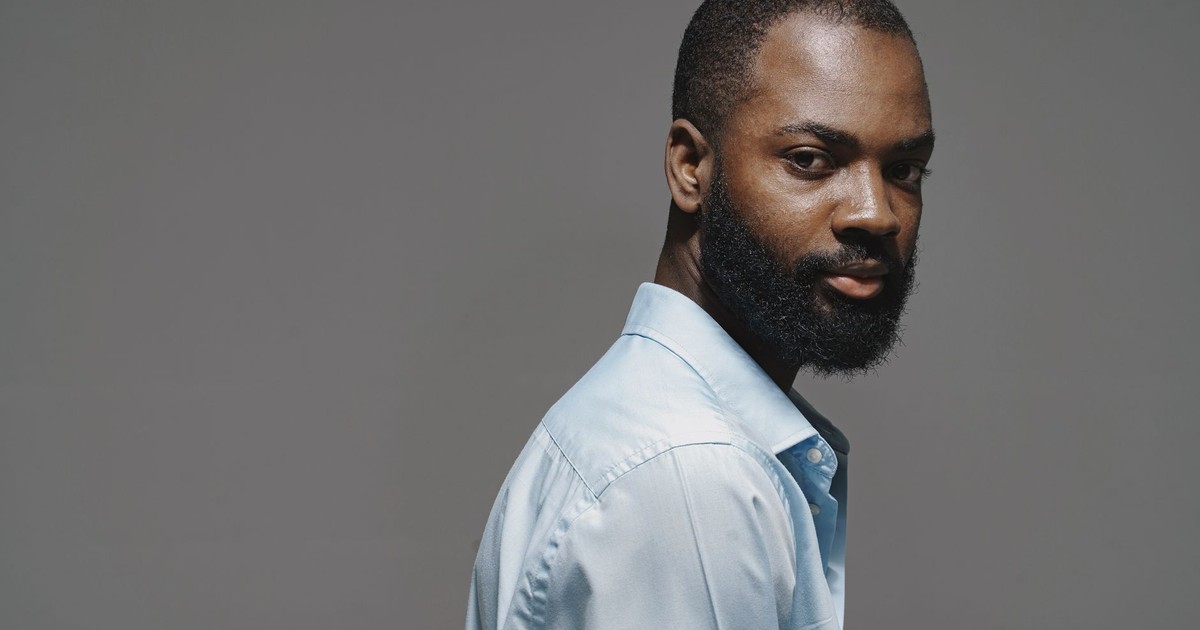
A study published in the Archives of Sexual Behavior examined 539 participants’ assessments of attractiveness, warmth, and competence in men dressed in different colors, including blue and white. Blue consistently registered as communicating warmth and approachability alongside competence – a pairing that’s genuinely difficult to manufacture and highly appealing when it appears naturally.
Light blue in particular – a chambray shirt, a pale blue Oxford, a sky blue crewneck – has a softening effect that darker colors don’t provide. It makes a man look rested, unhurried, and easy to be around. In contexts where relaxed ease is the goal rather than authority, light blue delivers something that navy and charcoal simply can’t.
The color also has a strong practical advantage: it suits a wide range of skin tones and reads well in both natural and artificial light, which means it performs consistently across different settings. A man who gravitates toward light blue in casual contexts has stumbled onto one of the most reliably attractive wardrobe choices available, even if he couldn’t explain exactly why it works.
What This Actually Tells You

The consistent thread running through all eleven of these colors is that attractiveness is rarely about the color in isolation – it’s about what the color communicates. Red signals status and power. Navy signals reliability. Burgundy signals deliberateness. White signals openness. The brain processes these associations so quickly that the assessment happens before conscious thought catches up, which is why a woman often can’t fully articulate why one man’s outfit registered and another’s didn’t.
None of this means wearing red guarantees anything, or that a man in charcoal grey becomes irresistible by virtue of the fabric. What it does mean is that color carries genuine psychological weight in how people are perceived, and that weight operates consistently enough across cultures and studies to be worth taking seriously. The most attractive version of any of these colors is still the one worn by a person who’s comfortable in it – because confidence, as it turns out, is the one variable that outperforms every shade on this list.
Disclaimer: This information is not intended to be a substitute for professional medical advice, diagnosis, or treatment and is for information only. Always seek the advice of your physician or another qualified health provider with any questions about your medical condition and/or current medication. Do not disregard professional medical advice or delay seeking advice or treatment because of something you have read here.
AI Disclaimer: This article was created with the assistance of AI tools and reviewed by a human editor.