

Why does a color that suited you at 40 suddenly look wrong at 55? After 50, the cells that produce melanin decline, leaving your skin with less of the pigment that once gave it warmth. That pigmentation used to act as a buffer, absorbing the light that fabric reflects back at your face, which meant you could wear a wider range of shades because your skin held its own. Now that the buffer has thinned, the colors you choose matter more, so finding the best shades for your skin tone takes more care.
But this works in your favor, too. When you wear something that matches your undertone, the reflected light adds warmth instead of draining it. It’s not a fix or a trick, just what happens when wavelengths complement your coloring instead of competing with it.
Why Your Skin Responds Differently to Color After 50
In 1979, dermatologist Barbara Gilchrest and her team at Boston University studied what happens to the skin’s pigment cells as people age. They took skin biopsies from donors aged 28 to 80. What they found was that melanocytes, the cells that produce melanin, decline by 6 to 8% per decade after age 30.
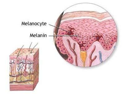
By the time you reach 50, you’ve lost somewhere between 12 and 24% of the cells responsible for giving your skin its warmth and depth. That loss doesn’t happen all at once, which is why the change sneaks up on you. The pigment that once gave your face a warm base has been thinning gradually, and at some point, the deficit becomes visible.
Your overall complexion becomes paler or takes on a grayish cast that wasn’t there before. The skin itself thins and becomes more translucent, which lets blood vessels show through in places they didn’t used to. That faint bluish undertone around your eyes or along your jawline is blood showing through thinner skin. And it can make you look tired even when you have slept 8 hours and feel perfectly fine. These aren’t flaws. They’re just what happens when the skin has less pigment and less thickness between the surface and what lies beneath.
Sun exposure adds another layer. UV damage accumulates over decades and eventually shows up as uneven pigmentation. With darker spots appearing in some areas while other patches lose color entirely. At 30, your skin could process sun exposure and distribute pigment relatively evenly. At 50, the system that handled that has slowed down, and the history of every beach vacation and afternoon in the garden starts showing on your face, hands, and chest. You end up with a mottled effect that wasn’t there when your melanin production was higher and more consistent.
All of this changes how color works on you. Whatever you wear near your face has more influence over how your skin appears. The wrong shade can pull out sallowness you didn’t know was there or make the circles under your eyes look deeper. The right shade does the opposite, adding back warmth and evening out what’s become uneven.
@jamiegenevieve Help #coloranalysis ♬ original sound – Jamie Genevieve
Justine Glaser, a certified color analyst who runs Colors by Midnight in Los Angeles, describes this shift as leaving what she calls the peak pigmentation window. In an interview with Glam, she explained that this window starts around 18 to 20 years old, after puberty, and closes around 45 to 50 when graying typically begins. After this window closes, the colors that suited you might need adjustment. Your fundamental season doesn’t change. Someone who tested as a spring at 25 is still a spring at 60. But the specific shades within that palette might need to shift toward softer or lighter versions. Because the intensity and clarity of your natural coloring have softened along with everything else.
Hormones factor into this as well. In 2016, researchers at the University of Pennsylvania asked why skin pigmentation often changes during pregnancy and menopause. Their findings, published in the journal eLife, showed that estrogen directly increases melanin production in skin cells. While progesterone has the opposite effect. When estrogen levels are high, as they are during reproductive years, melanocytes produce more pigment. When estrogen drops after menopause, that production slows. This means the warm or cool quality of your undertone can actually shift when your hormone levels shift. Because the balance of pigment in your skin has changed. Colors you wore confidently for decades can suddenly feel off, and it’s not your imagination or the lighting. Your undertone may have genuinely moved, and your wardrobe hasn’t caught up yet.
The same sensitivity that makes wrong colors more punishing also makes right colors more effective. When you understand what’s actually going on with your skin, you can stop blaming yourself for looking tired in certain outfits and start choosing shades that work with the face you have now rather than the one you had at 35.
The Science of Color Harmony
The idea that certain colors look better on certain people isn’t just fashion advice passed down through magazines. Researchers at the University of St Andrews wanted to test whether clothing color preferences follow predictable rules based on skin tone. What they found confirmed what stylists have been saying for decades.
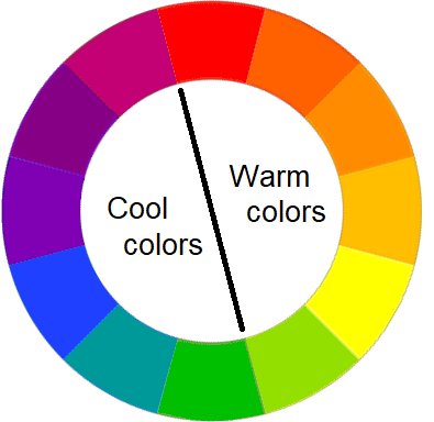
In a 2021 study published in the journal i-Perception, Professor David Perrett and his team showed participants images of women’s faces and asked them to adjust the color of simulated clothing to find the most flattering match. They gave participants the entire spectrum to choose from. Every hue at every saturation and brightness level. So nothing was off limits. Despite all those options, participants consistently gravitated toward blues and orange-reds, and 75% agreed on which colors suited which faces.
The researchers measured skin tone objectively using colorimetry, which quantifies the hue, saturation, and brightness of skin. Faces with fair, cool-toned skin were matched with blue hues. While faces with warmer, more tanned skin were matched with orange and red tones. The preference held across different participants. This suggests this isn’t random personal preference but something more consistent in how people perceive faces and color together.
Perrett’s team speculated that the preference might connect to an unconscious association between climate and coloring. Where cool blue hues evoke northern climates with fair-skinned populations and warm hues evoke southern climates with darker skin. Whatever the psychological root, the practical takeaway matters more. When the undertone of your clothing matches the undertone of your skin, people perceive that as attractive. Not because of fashion rules, but because of how their visual systems process the combination.
This harmony has a physical basis. When you wear a colored garment, the fabric absorbs certain wavelengths of light and reflects others. Those reflected wavelengths don’t just travel to other people’s eyes. They also bounce onto your skin and create a secondary color cast. If the reflected light complements your natural undertone, it enhances what’s already there. If it clashes, it creates competition between the fabric’s reflected color and your skin’s natural color, and your face ends up looking off. The effect is strongest within about 12 inches of your face. Because that’s the zone where reflected light actually reaches your skin in meaningful amounts. This is why the color of your shirt, scarf, or earrings matters far more than the color of your pants or shoes. Anything near your face is casting light onto it, and anything below your waist isn’t.
Photography professionals understand this intuitively. On set, crew members often wear dark, neutral colors specifically to avoid reflecting unwanted hues onto their subjects’ faces. A photographer in a bright red shirt standing close to a model can actually tint the model’s skin in ways that show up on camera. The same physics apply in everyday life, just at a subtler level. You might not notice that your mustard yellow sweater is casting a yellowish tone onto your face. But your brain registers that something looks slightly off, and so does everyone else’s.
Perrett’s team pushed the question further in a follow-up study published in Psychology of Aesthetics, Creativity, and the Arts in 2023. This time, they tested whether eye color influences which clothing colors flatter the face. Blue and gray eyes paired well with cool blue fabrics, while dark brown eyes looked better with warm red tones. To figure out whether eyes or skin drove this preference, the researchers digitally swapped the eyes between light-eyed and dark-eyed faces. When a naturally dark-eyed woman was given light eyes, participants changed their color preferences to match the new eyes rather than the unchanged skin. This makes sense when you consider that people look at eyes first when they look at a face. The harmony between your clothing and your eye color registers strongly because that’s where attention lands.
What this research confirms is that color matching isn’t arbitrary, and it isn’t purely cultural. There are measurable optical interactions between fabric, light, and skin that determine whether a color enhances your appearance or works against it. After 50, these interactions become more visible because your skin has less natural depth to absorb or offset reflected light. A color that might have been merely acceptable at a young age can look actively wrong at an older one. Your skin isn’t compensating the way it used to. So the color has to do more of the work on its own. The good news is that when you choose correctly, the effect is also stronger. The right color near your face at 55 does more for you than it would have at 35, because there’s less competing with it.
Finding Your Color Season After 50
Seasonal color analysis is a system that categorizes people into palettes based on their natural coloring. Personal color consultant Carole Jackson popularized the concept in her 1980 bestseller Color Me Beautiful. Which sorted everyone into 4 categories named Spring, Summer, Autumn, and Winter. Each season corresponds to a different combination of warm or cool undertones and light or deep coloring. Spring and Autumn are the warm-toned seasons. Meaning people in these categories have golden or peachy undertones and look best in colors with yellow or orange bases. Summer and Winter are the cool-toned seasons. Suited to people with pink, blue, or reddish undertones who look best in colors with blue bases. If you’ve ever heard someone say they’re a “winter” or an “autumn,” this is what they’re referring to.
Jackson’s 4-season system became a cultural phenomenon in the 1980s, but practitioners eventually noticed that not everyone fit neatly into one of 4 boxes. Some people displayed characteristics of two or more seasons, which led to the development of expanded systems with 16 sub-seasons.
You might be a Light Spring, whose best colors are warm but pale and clear. Or a Deep Autumn, whose best colors are warm but rich and saturated. Two people in the same overall season can look very different from each other and need different shades within their shared palette. A Light Summer looks washed out in the dark, saturated colors that make a Deep Summer glow. Even though both are cool-toned. The more refined systems also account for whether your coloring is muted or clear. Which determines whether you look better in soft, dusty tones or bright, saturated ones.
Your fundamental season doesn’t change over your lifetime. But the specific shades that work best for you can shift as your coloring softens. Glaser, the Los Angeles color analyst mentioned earlier, told Glam that “when someone receives the result of spring, for example, they will be a spring for the rest of their life.” The underlying warm or cool quality of your skin stays constant because it’s determined by the blood and tissue beneath the surface. Not just the melanin that fades with age.
But someone who was once a Warm Spring with a strong golden undertone might find that a softer, lighter version of that palette works better after 50. The saturation has to come down because there’s less saturation in the skin to match it. Gray or white hair adds another consideration. Regardless of what your natural hair color was, gray and white hair have cool undertones, and this can shift the overall balance of your coloring. Some people find they look better in slightly cooler versions of their seasonal palette once their hair changes, even if their skin undertone remains warm.
You can get a rough sense of your undertone at home without professional help. Look at the veins on the inside of your wrist in natural daylight. If they appear greener, you likely have warm undertones. And If they appear more blue or purple, you likely have cool undertones. If you genuinely can’t tell or they seem to be both. You may have neutral undertones that can swing either direction depending on the shade.
Another test is to hold a piece of pure white paper next to your face and watch what happens to your skin by comparison. If your face looks yellowish and healthy against the white. You probably have warm undertones; if your face looks clear and bright, you probably have cool undertones. If the white makes you look grayish or drained. That’s a sign you lean warm and need some yellow or cream in your whites rather than pure stark white.
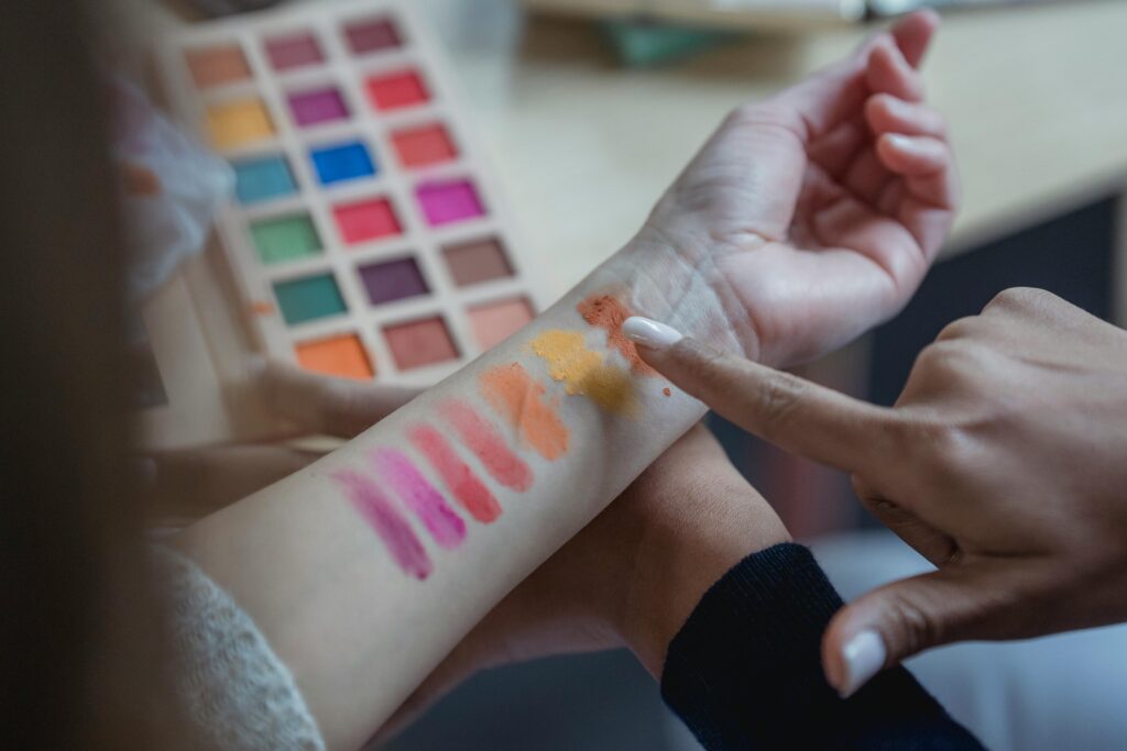
The most reliable method is to drape fabrics of different colors near your face and observe what happens to your skin. This is what professional color analysts do, and you can try a simplified version at home with clothing you already own.
A color that works for you will make your face look even and smooth, minimize shadows under your eyes, and give your skin a healthy quality you can actually see. A color that doesn’t work will do the opposite. It will emphasize lines and discoloration, make shadows look deeper, and give your face a sallow or grayish cast that reads as tired. If you have never paid attention to this consciously, pull out 5 or 6 tops in different colors and try them on in front of a mirror in natural light. You’ll likely notice that some pieces always make you feel confident while others sit in your closet unworn, and the difference often comes down to color rather than fit or style. Once you see it, you can’t unsee it, and you’ll start making different choices without having to think about it.
Putting Your Colors to Work
Start with the pieces closest to your face, where the effect is strongest. Glaser describes choosing the best clothing colors for your complexion as having “a natural Instagram filter” because of how effectively they minimize dark circles, uneven pigmentation, and dullness. If you’re not ready to overhaul your wardrobe, start with a single scarf or blouse in one of your best shades and pay attention to how your face looks when you wear it compared to something you suspect doesn’t work. The difference is often visible within seconds.
Colors that sit further from your face matter much less for your complexion. Which gives you more flexibility with pants, skirts, and shoes. You can choose those based on personal preference or what coordinates well with your face-framing pieces. Many stylists recommend building a wardrobe with neutral bottoms and saving your best colors for tops and accessories. This makes practical sense. You end up with more outfit combinations while ensuring that the colors closest to your face are always working in your favor rather than against it.
Two colors that often stop working after 50 are pure white and pure black. Stark white can be too harsh against skin that has lost some of its warmth, and the contrast creates a washed-out effect that makes you look paler than you are. Off-white, ivory, or cream may be more flattering depending on your undertone because they reflect softer, warmer light back onto your face. Pure black presents a different problem. It can drain color from your face and emphasize shadows and lines, particularly if you have cool or muted coloring.
Charcoal, navy, or espresso brown often serve as more forgiving neutrals that provide the same anchoring effect without the harshness. This doesn’t mean you can never wear black or white again. But it does mean you might want to keep them away from your face or break them up with a scarf or necklace in a more flattering shade.
Your hair color interacts with your clothing colors, too, and this becomes especially relevant if you’ve gone gray or white. Gray hair has a cool undertone regardless of what your original hair color was, and this can shift the overall balance of your coloring even if your skin undertone hasn’t changed. Some people find they need to adjust their palette slightly cooler to account for the gray. While others find that warm colors near the face help counteract the coolness of the hair and restore the vibrancy they feel they’ve lost.
Both approaches can work depending on your specific coloring. If you dye your hair, the shade you choose should work with your seasonal palette rather than against it. Or you’ll find yourself fighting the same battles with your clothing colors that you thought you’d solved.
Read More: Meet Nyakim Gatwech, the Sudanese Model known as the “Queen of Dark”
Makeup follows the same principles. Foundation should match your skin tone, but blush, lipstick, and eyeshadow work best when they align with your seasonal undertone. A warm-toned person wearing cool pink lipstick will look off even if the shade technically matches her skin depth. While the same person in coral or peach will look naturally healthy because the warmth in the lip color echoes the warmth in her skin. The goal is harmony across everything near your face. From clothing to jewelry, metal to cosmetics, so that nothing competes and everything works together.
Color is one of the few tools for looking more vibrant that requires no procedures, no products, and no particular skill. It costs nothing to move a flattering blouse to the front of your closet or to stop reaching for the one that always makes you look tired. The changes in your skin after 50 are real, but they don’t have to mean accepting a duller appearance. Understanding which colors create harmony with your coloring gives you an advantage that most people never think about. And the payoff is visible every time you catch your reflection.
Begin by noticing. Pay attention to which colors bring you compliments and which ones you avoid without knowing why. Hold different shades near your face in natural light and watch what happens to your skin. The right colors won’t transform you into someone else. They’ll simply let your face look the way it’s supposed to.
Read More: Internet Divided Over Gen Z Fashion After Controversial Photo Goes Viral